Okay, I'm feeling some serious love for Apartment Therapy these days. Just this past week, they featured my sister's home AND they featured If It's Hip, It's Here on their Behind The Blog series.
First off, I hadn't done a story on my own sister and her husband's cool home in San Francisco for fear of coming off as the nepotistic blogger. But their having turned an old San Francisco Police Station into a modern home is certainly blogworthy, at least Apartment Therapy thought so. They posted a very nice article and interview on the home in their House Tours section so now I figured it's safe to share it with you.
They did such a nice job I'm gong to reprint their post, only include all the slide show shots here with the article and break them into categories. Yes, my whole family is quite hip. I'm a lucky girl.
Name: David Tomb and Susan Sweet
Location: San Francisco
Size: Living area 1700 sq. ft., office/studio 700 sq. ft.
Years lived in: 10 years owned
Back in 1996, the architect Bruce Tomb heard about a 1950s dragnet-style police precinct coming up for public auction in San Francisco. At the time, Bruce's brother, the artist David Tomb, and his wife, Susan Sweet, were living in New York, but hoping to come back to the Bay Area to start a family. Together they bought the building at auction—Willie Brown's signature is right there on the deed—and Bruce redesigned the police station, envisioning a kind of compound with live/work spaces for both brothers' families. The result of the two-year renovation is a gorgeous, light-filled space unlike any home we have seen before.
Front entrance and main space:


Living room:


livingroom details:


Dining area:


Kitchen:


Visitors enter the "compound" down a long driveway lined with flowering vines. The live/work spaces are arranged around a parking lot that's been converted into a garden courtyard (with space for parking, too). A native plant garden offers inviting, dappled shade, and nearby a wide glass door leads into David and Susan's home.
exterior and parking:

Front door:

Atrium in the middle of the home.

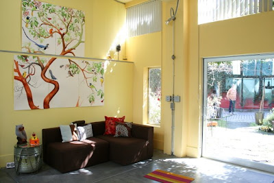
The quality of the light inside is so spectacular that it almost feels like you're still outdoors. With its soaring ceilings, numerous well-placed skylights, and open central lightwell, the home is designed to take in natural light from every possible direction. David and Susan have arranged their space to make the most of their abundance of sun and space, painting the walls in bright but soothing yellows and greens and hanging large artworks (some of which are David's own) that would hardly fit in a room with standard ceiling height. They embrace the open plan of their living space, eschewing room dividers and closed-off vignettes in favor of an uncluttered layout in which one space flows easily into the next. Even their son's room, the smaller of the two bedrooms, has a wide-open feel, with an outer playroom leading into a skylit sleeping area.
Master Bedroom:


master bath:

My nephew's room with front playroom:


David's studio and Susan's office are just a short walk away, down an outdoor hallway. The arrangement seems ideal, though we're not sure how anyone could work with such an inviting place to relax nearby!
David's Studio:


To see David's stunning artwork, visit his site here.
AT Survey:
My/Our Style: Modern eclectic.
Inspiration: The building was the starting point—a modern utilitarian building.
Favorite Element: Open floor plan and amazing light quality, plus conversion and design of parking lot into California Native garden.
Biggest Challenge: Continuum of building maintenance (good luck in the boiler room).
What Friends Say: Where are the jail cells? (They’re still here, in the other part of the building.)
Biggest Embarrassment: Oh yeah, there was that time the neighbors didn’t really like the concrete cutter noise decibels at 8am.
Proudest DIY: Interior color design.
Biggest Indulgence: The custom-made bookcase in the family room.
Best Advice: Everything will take double the amount of time and money to complete that you think it will, but ultimately is hugely gratifying.
Dream Source: Bruce Tomb, designer and architect; David Tomb, artist; Matarozzi and Pelsinger builders.
Resources:
Main Room:
Knoll furniture (Barcelona chair, Gehry chair)
Herman Miller (Eames chair)
Umbra (Karim Rashid Oh Chairs)
Anthropologie (pillows)
Electric Works Gallery Store (ceramic owl piggy bank)
Marble 1965 dining table salvaged from East Bay bank
Main Room Art :
David Tomb (portraits and birds)
Cathy Liu (volcano print)
Lynn Beldner (sculpture, plaster with objects)
Steve Briscoe (glass bullhorn, pimp drawing)
Matt Gil (ceramic and metal sculptures)
Mata Ortiz (spider pot)
Donald Tomb (salvaged lighthouse lenses)
Atrium:
Yerba Buena nursery
Flora Grubb Gardens
Child’s Room:
Bachmann and Lionel Trains
Oakland school district salvaged map
Steve Briscoe (lamb print)
Master Bedroom:
Turn of the Century Fine Arts (Jane Bench)
Herman Miller (Eames chair)
Master Bedroom Art:
Barry Simons
Merav Tzur
Kenney Mencher
Jurek Bitter
Ethel Sweet
David Tomb
Lynn Beldner
Master Bath:
Bruce Tomb, Infinite Fitting (bronze cast sinks)
Steve Briscoe (plaster bear)
(Images: Susie Nadler for Apartment Therapy)

Wanna see The 'behind the blog' article on If It's Hip, It's Here?
It's on their Unplggd section here.
More on David Tombs' Art:
•Meet David Tomb (His work is the Bomb)
•David Tomb's First Non-Portrait Show in 20 Years Opens In San Francisco
•Art That's For The Birds (Literally). And A Peek Into A Painter's Project Room.
•Better Flock To David Tomb's Next Art Show: Birds Of The Sierra Madre
