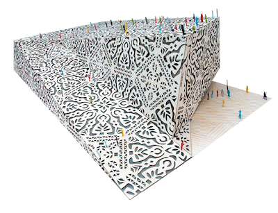
Above: First prize in the competition for concept architectural design of the Polish Pavilion for EXPO 2010 in Shanghai
The victorious design entry for the Polish Pavilion in Shanghai's 2010 Expo is an unusual building resembling a giant paper cut out. To learn more about the contest, the jurors and the rewards, please go here.

Designed by a team of architects which is made up of Wojciech Kakowski, Natalia Paszkowska, and Marcin Mostafa, they describe the winning design as such:
Due to the nature of the exhibition the object must also aesthetically characterise its country of origin, forming a recognisable and stylistically strong cultural landmark. In our basic proposition the essential theme for cultural communication is that of the folklore cut-out. The subject will be presented in a contemporary architectural design. The design will fulfill two goals. Firstly we hope to avoid literal traditionalism and the mechanical repetition of canonical forms. The design of the object is intended to link with tradition, but also to be contemporary, a stylised reinterpretation, creatively connecting to today and inspired by the past, yet not followed it rigidly.
Secondly, a major concern is that the pavilion is a self contained structure, in a purely architectural sense: a calling card of Polish architectural achievement. It must be an attraction and an object which is distinguishable externally, among the backdrop of the other EXPO buildings in daytime – also being lit up outside – at night, it must also make a strong impression internally, by an interwoven design so that the sunlight forms space beneath vaulted arches. The shape of the mass, with many acute surfaces, on one hand fulfills and suggests a folded cut-out card, while on the other hand creates a geometrically interesting interior, which is also an elastic space, that can be creatively divided into interior sections, divided into functional areas for expositions, concerts and domestic needs.


Above: the design team

Above: the totally cool entry ticket, designed in keeping with the look of the pavilion.

Above: Two of the three members of the design team with their winning entry.


Above: the pavilion as it would appear lit at night
To see more sketches, elevations and learn more about the design process, go here. Congratulations guys! It's beautiful. I can't wait to see it in person.You can congratulate them too. Right here.